Shaking up my Instagram with Milkshake
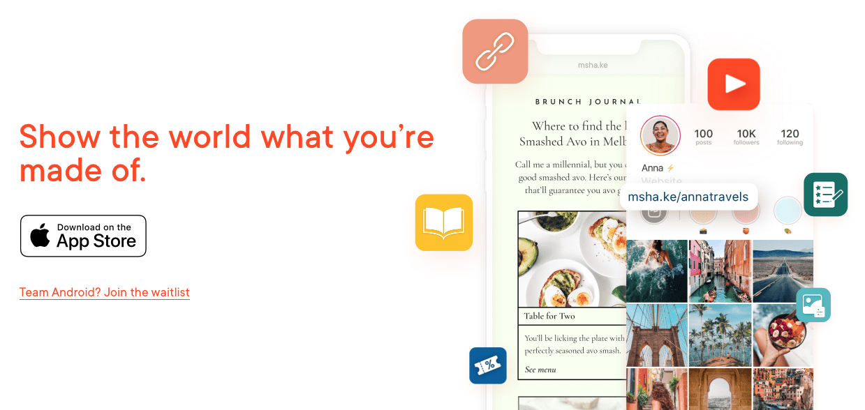
If you follow me on Instagram and more importantly if you follow my stories, you will know I have upped my instagram game with the introduction of Milkshake to show off my links and profile.
For a while, like many people I have floated between using link shorteners and multi link options to get around the limitation Instagram places on the amount of links you can put in your bio (it's one if you didn't know). So for bloggers, vloggers and content creators this is usually not enough which means using options like Linktr.ee.
However this is limited as a free version and I've never been sold on paying for some of the additional features it offers.
In steps Milkshake which I have seen advertised for a while but hadn't got around to using it. Luckily, during the Black British Bloggers event I took note of Nicole Ocran's instagram and more importantly her bio and spotted she was using Milkshake, and it looked beautiful. We had a chat about it and I was quickly convinced it was something I did need to look into. Hours later I was setting my own up and publishing it. You can literally create your own in minutes and produce a mini website to help guide your Instagram users to the links you want them to click on.
I personally think this is a fantastic addition to the digital space where Instagram is increasingly an important part of digital journies and websites not always where people begin, having an effective sign post for your followers is a must.
How I will be using it as you might notice from when this blog is published is to direct my audience to new content on my blogs. I'll also be using it as an additional way to showcase my photography and videography.
The way the app is constructed however has the potential to create a new blogger that completely uses Milkshake which is exciting to say the least.
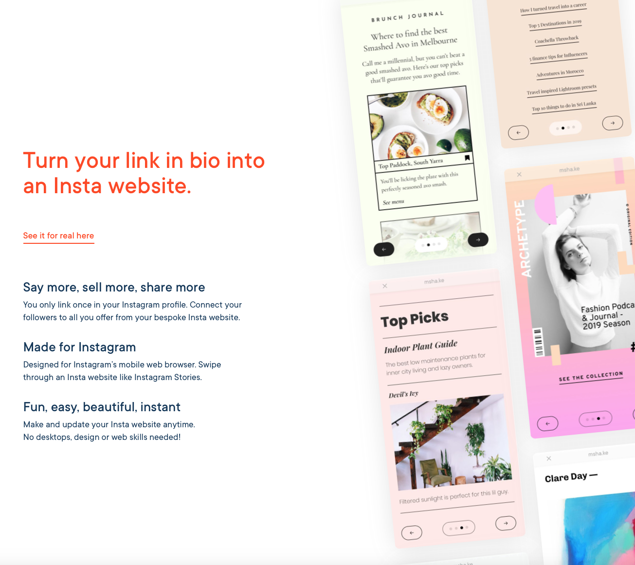
Unlike other multi-link options this free app offers users a fully customisable card experience which feels natural for users.
The app seems to be targeting female creators which is honestly from my experience a large majority of the bloggers and vloggers out there.
The cards currently available include:
- About
- Links
- Top Picks
- Splash
- YouTube
Each with some set layouts for users to choose from and within them the option of how to customise them for your content.
Currently the only limitations with Milkshake that I can see are that it can only be edited via the app on iphone with no web version and unfortunately for you Android users...no Android App yet. They are working on an Android version of the app according to their FAQ but no date as to when this will be. It has only been a few months since the app was released so fingers crossed this is just the start of things to come. As a fan of story telling visual and textual, Milkshake is a much needed breath of fresh air in this fast moving digital world.
You can view my Milkshake site here if you didn't come via instagram. If you need some help with putting together your own let me know, I'm happy to help.
Milkshake is completely free currently. I recommend taking advantage while it lasts.


